I have always been fascinated by non-Latin writing systems. Chinese characters, Japanese kanji, Arabic calligraphy, and Korean hangul feel dense and meaningful. Each symbol looks like a small object, not a thin line in a sequence.
To me, Western letters feel more separated and linear, like sticks placed side by side.
I wanted to see what would happen if those familiar letters were pushed together until they became something more symbolic.
That idea became my Gridlock Glyphs, a web experiment made with basic HTML, CSS, and JavaScript.
It uses only five uppercase letters: H, L, E, F, and I. I chose them because they are built only from straight lines and right angles.
No curves, no decorative details.
Each one has at least one solid edge that lets the letters lock together tightly.
I nuked the letter T because its crossbar creates too much empty space and breaks the block-aesthetic.
Here is how it works.
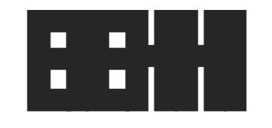
When you press “Randomize,” the app shuffles the five letters into a short string and displays them very large, with tight spacing. The letters collapse into a single heavy shape. Up close it is hard to read. From a distance it starts to look like a symbol, a logo, or an emoji fragment. Below it, the same letters appear smaller with normal spacing so you can see what the block came from.
OK, it’s also a fidget toy in a sense.
This version allows you to add any combination of FILEH and force a glyph.
Ultimately this started as a small experiment in abstraction.
When you compress letters hard enough, they change.
In my imagination it’s a Zen Koan of sorts.
With enough manipulation, letters stop being obvious text and start becoming shapes.
Meaning does not disappear.
It shifts.
In a world full of emojis and symbols, this is a reminder that meaning can be flexible when shaped by form.
Figure out which combination I used to create this one:
Discover more from MATTLR.COM
Subscribe to get the latest posts sent to your email.
